Published Date: Feb 27, 2026
Written by: Emma Cyrus, Senior Copy, Content & Editorial Writer
Reviewed by: Shahnaz Hashim, Architectural Designer at FCI London
Edited by: Zoona Sikander, Head of Content
Estimated Reading Time: 5 minutes
TL;DR - Monochrome interiors are one of the most misunderstood briefs I receive, and also one of the most rewarding to execute well. The assumption that "one colour" means one flat, repetitive shade is where most people go wrong. Done properly, a monochromatic scheme is actually one of the most liberated approaches to interior design available to you, offering enormous range within a single colourway. Here is how I approach it, and how you can too.
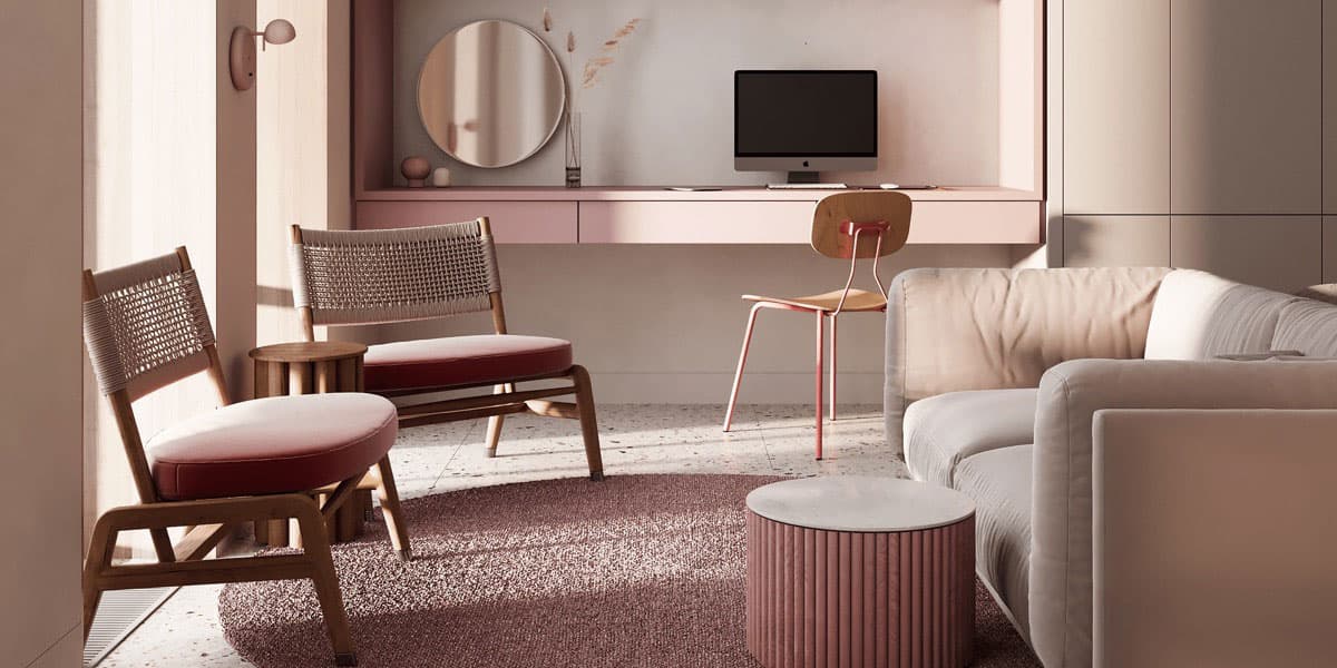
Table of Contents
Monochromatic interiors have been in vogue for quite some time now, and the trend shows no sign of retreating. But in nearly every initial client consultation where the word comes up, I find myself explaining the same thing: monochrome does not mean monotonous.
Yes, monochrome translates literally to "one colour." No, that does not mean you are committing yourself to a single, stagnant shade applied uniformly across every surface. Fully exploring this approach reveals a surprisingly diverse range of possibilities. When implemented with genuine thought, a monochromatic interior achieves something rather elegant: an eclectic richness that somehow still feels calm, cohesive, and quietly minimal. That tension between variety and restraint is precisely what makes it so compelling to work with.
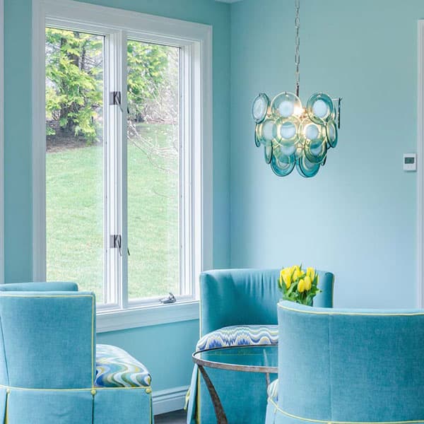
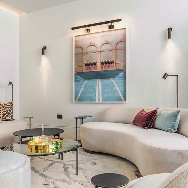
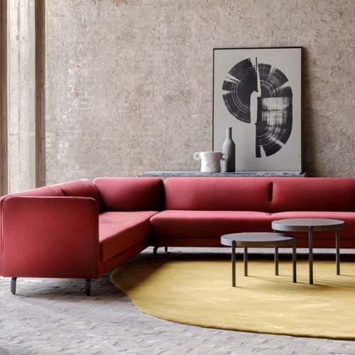
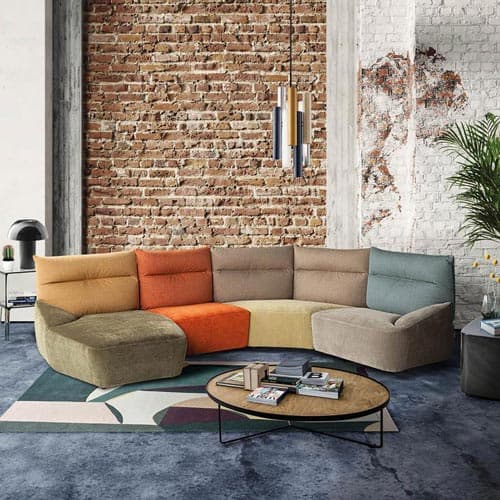
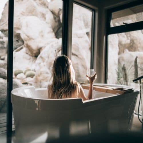
The first mistake I see, almost without exception, is that clients assume monochromatic means neutral. A beige room is technically monochromatic, yes. But so is a room built entirely around a deep, considered green, or a layered palette of blues ranging from barely-there robin's egg to near-midnight Prussian. Crisp black-and-white schemes have their place and can look enormously professional and elegant, but they often lack the personal warmth that makes a space feel genuinely inhabited rather than photographed.
Any colour can be refined into a compelling monochromatic interior. The question is not which colour is safest. The question is which colour, in all its variations, genuinely reflects how you want to feel in the room.
Key Takeaway: Do not default to neutrals simply because they feel safe. The most memorable monochromatic interiors I have designed have been built on colours that required a little courage to commit to.
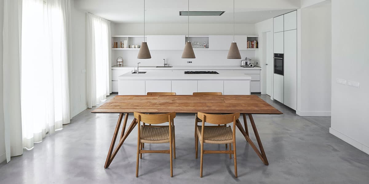
When a client comes to me wanting a monochromatic scheme, the first thing I do is look at what is already in the room. Flooring, existing furniture, window frames, architectural details: these all carry colour, whether the client has noticed it or not. There is very little point in selecting a base colour in isolation when the room itself is already having its own quiet conversation about tone.
Starting from the ground up and acknowledging the colours already present is the most reliable foundation I know. From there, I choose a base colour that works with those existing elements and build outward using a range of hues, tones, and tints within the same shade family. If we settle on blue, for instance, we might layer Robin, Royal, Cobalt, and Prussian together, each carrying its own weight and character within the overall palette. The beauty of monochromatic design is that it actually permits more variation than many polychromatic schemes, because every choice belongs to the same family.
One technique I use regularly is consulting the colour wheel to identify the complementary colour directly opposite the base shade. A carefully placed accent in that complementary colour, used sparingly, provides a refreshing contrast without undermining the overall scheme. A tan leather armchair in a beige room. A touch of warm amber in a blue-led space. These small departures, when handled with discipline, add the kind of life that a purely single-note interior can occasionally lack.
The rule I always come back to is the 80-20 ratio. Your base colour should dominate eighty percent of the space. The remaining twenty percent is where you earn your interest. Stray beyond that and you are no longer designing a monochromatic interior. You are simply decorating a room in a colour you quite like.
Key Takeaway: Begin with what the room already tells you, then build deliberately. The 80-20 rule is not a creative constraint. It is what gives the scheme its authority.
One of the things I enjoy most about monochromatic design is the way it forces a genuine engagement with the value of colour, not just the colour itself. Value, in this context, means the relative lightness or darkness of a shade, and it is what defines the atmosphere of a room far more than most clients initially realise.
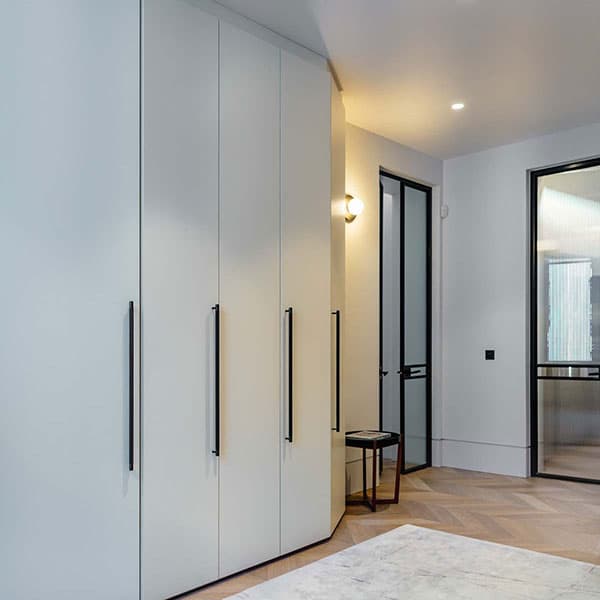
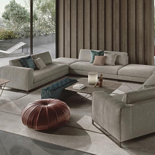
Lighter values and pastel versions of your chosen colour are always a reliable way to create a sense of space and contemporary elegance. Light shades breathe. They allow smaller details and considered accessories to register rather than disappear into visual noise. For rooms that are already compact, or for clients who want a sense of airiness without sacrificing commitment to a colour, lighter values are where I begin.
Darker values bring an entirely different quality: depth, drama, and a certain enveloping warmth that lighter schemes simply cannot produce. The discipline required here is balance. If a bold, saturated shade is the focal point of the room, everything else needs to give it room to be exactly that. A dark wall deserves calm, considered companions.
For clients who find the idea of committing to a single colour in all its variations genuinely daunting, there is a third path I often suggest: use your base colour in combination with black and white. This creates a starkly defined, chic scheme in which the whites provide airy relief, the black grounds and sharpens, and your chosen colour sits between them with considerably more presence than it would have achieved alone.
Key Takeaway: The value of your colour matters as much as the colour itself. Before committing to a shade, consider what you want the room to feel like at eight in the morning and again at eight in the evening.
If a client shows me a monochromatic room that feels flat and uninspired, I can diagnose the problem almost immediately. The colour is probably fine. What is missing is texture.
This is the point in the project where I find myself saying the same word repeatedly: texture, texture, texture. A monochromatic scheme, precisely because it operates within such a defined palette, relies entirely on material variation to create depth and visual interest. Without it, the eye has nowhere to travel.
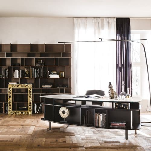
In practice, this means bringing together materials that behave differently under light. Textured wallpapers alongside smooth plasterwork. Coarse natural fibres next to sleek lacquered surfaces. Woven rugs and throws that absorb light rather than reflect it. Rustic wooden finishes paired with aluminium structures or warm woollen fabrics against glistening marble. These combinations work with your monochromatic palette rather than against it, creating an image that reads as layered and considered rather than simply colour-coordinated.
Captivating artworks, intriguing patterns, and even the smallest finishing details matter enormously here. A patterned throw cushion, well chosen, contributes far more to a monochromatic interior than it would in a busier, multi-colour scheme precisely because it has room to be noticed. I always tell clients: in a monochromatic room, every object makes a statement whether it intends to or not. That is both the challenge and the pleasure of working within this discipline.
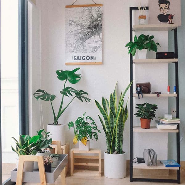
Do not overlook planting either. A considered indoor plant adds a layer of organic texture and brings a warmth that is difficult to achieve through furniture and accessories alone. In a room built around cool, precise tones, a Peace Lily or a trailing English Ivy introduces exactly the kind of softness that prevents a scheme from feeling clinical.
Key Takeaway: Texture is not a finishing touch in monochromatic design. It is the structural element that makes the entire scheme work. Invest in material variety before you invest in accessories.
One aspect of monochromatic interiors that I genuinely enjoy discussing with clients is how remarkably easy they are to refresh. Because the palette is so clearly defined, introducing new pieces or updating accessories is a straightforward exercise rather than a design project in its own right. A new set of cushions, a different rug, an updated artwork: each of these can shift the character of the room perceptibly without disturbing the overall scheme.
For clients who tend to tire of interiors relatively quickly, or who anticipate wanting to evolve a room over time without starting again from scratch, a monochromatic foundation is one of the most intelligent investments they can make.
Key Takeaway: A well-executed monochromatic interior is one of the easiest schemes to refresh and evolve. The discipline of the palette is precisely what makes it so adaptable.
Understanding colour theory, distinguishing cool tones from warm ones, identifying which shades genuinely complement rather than merely coexist: it can all become quite overwhelming quite quickly, even for clients with a well-developed design sensibility. I say this not to discourage, but because knowing where the complexity lies is the first step towards navigating it well.
If you are attempting a monochromatic scheme for the first time and it is not landing the way you hoped, the answer is almost certainly more texture, a reconsideration of your light-to-dark value balance, or both. It is rarely the colour itself that is the problem.
Our design team at FCI London works with monochromatic briefs regularly, and we are well practised at helping clients move from a colour they love to a scheme that genuinely performs. I invite you to visit our showroom or book a consultation, and let us take that process off your hands entirely. The result, I can assure you, is worth considerably more than the effort of getting there alone.
Key Takeaway: Texture is not a finishing touch in monochromatic design. It is the structural element that makes the entire scheme work. Invest in material variety before you invest in accessories.
Address & Hours:
FCI London, Rays House, North Circular Road, London, NW10 7XP
Monday - Saturday: 10am - 6pm
Sunday & Bank Holidays: 11am - 5pm
Contact Details:
Phone: +442081531235
Email: [email protected]
What to Bring:
Customer Reviews
Chava Kahn
"Service was personalised and excellent. Sanjay saw us through the process from start to end, ensuring that we were happy with our choices. The delivery guys were amazing and went the extra mile."
Nedelia Martin
"I discovered FCI London almost 5 years ago, and I keep going back to them when I need to buy furniture. The team is fantastic - both the sales staff and the in-house designer were knowledgeable, helpful, and really took the time to understand my style."
Carol O'Regan
"Ricardo at FCI provided great customer service with his expertise and advice. The quality of the chairs and bar stools is excellent and fits in with our kitchen/diner well."
We help designers & clients transform mundane spaces into extraordinary ones.


Book a video consultation and we'll advise you on furniture, space planning, colour schemes and much more.
Book A ConsultationBook a visit to our stunning, multi award-winning, 30,000 sqft.
Over 700 brands under 1 roof.
Most Popular on FCI London: Fitted Wardrobes | Luxury Designer Rugs | Luxury Sofas | Luxury Furniture Store | Luxury Interior Designers | Luxury Bedroom Furniture | Luxury Modern Chairs | Luxury Coffee Tables | Luxury Designer Kitchens | Luxury TV Units | Luxury Dining Tables | Luxury Storage Solutions | Luxury Sideboards | Luxury Stools & Bar Stools
Transparency isn’t a policy. It’s a principle.
Have a peek at what our clients really have to say.