Published Date: Apr 13, 2025
Written by: Emma Cyrus, Senior Copy, Content & Editorial Writer
Reviewed by: Shahnaz Hashim, Senior Interior Designer at FCI London
Edited by: Zoona Sikander, Interior Design Writer & Social Media Content Creator
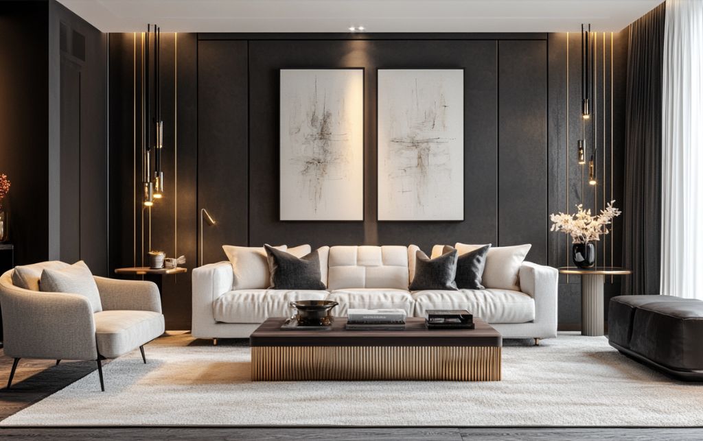
Table of Contents
Far from being merely a neutral foundation, these sophisticated pieces act as the quintessential canvas upon which the rest of a room's narrative unfolds. As a senior designer at FCI London, I've guided countless clients through the intricacies of incorporating these statement pieces into their homes.
The conversations inevitably turn to the same question: "What colours will work best with my white rug?"
It's a deceptively complex inquiry. A white rug isn't simply white—it's a symphony of undertones, textures and finishes, each interacting differently with your selected palette.
Before we delve into specific colour combinations, it's worth understanding the underlying principles at play when dealing with luxury rugs. A white rug creates a sense of spatial expansion and serves as a reflective surface, amplifying both natural and artificial light.
This reflective quality means your colour choices will be magnified in their impact—a subtle dusty pink becomes more pronounced, a deep navy more commanding.
What many of my clients initially fail to appreciate is that these pairings aren't merely aesthetic decisions, but psychological ones. The right combination doesn't simply please the eye - it affects how one experiences the space, influencing everything from perceived temperature to emotional response.
In my experience, the most successful white rug pairings achieve three critical balances:
With the above principles in mind, let's explore the ten combinations I've found to be most effective over a decade of practice.
There's a reason navy blue paired with a white rug remains the most frequently requested combination in our consultations. This pairing offers the perfect balance of contrast and sophistication without venturing into stark territory.
What makes this pairing particularly successful is the navy's remarkable versatility—it functions effectively as both a background and an accent. The combination creates spaces that feel simultaneously timeless and contemporary, with a refined elegance that never appears contrived.
The key to mastering this combination lies in selecting the correct shade of navy. I advise avoiding navies with pronounced purple undertones when pairing with white rugs, as they can create a dissonant, slightly jarring effect.
Instead, opt for navies with subtle grey or green undertones - they create a more harmonious dialogue with the white.
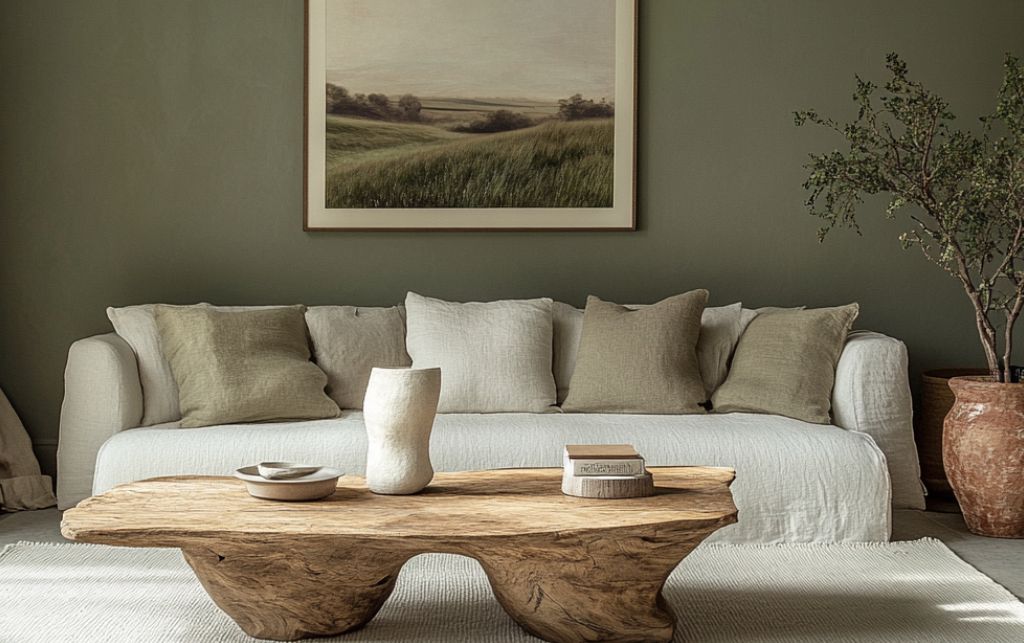
In recent years, I've noted a pronounced shift towards biophilic design elements amongst our more discerning clientele. Sage green rugs have emerged as the perfect companion to white rugs in these nature-inspired spaces.
Unlike more vivid greens, sage possesses a dusty quality that complements rather than competes with the rug's pristine presence. What makes sage particularly effective is its ability to introduce colour without dominating the space.
It recedes visually in a way that more assertive greens simply cannot, creating a balanced composition where the white rug remains a focal point rather than merely a background element. The effect is one of refined tranquillity—a sophisticated take on bringing the outdoors in.
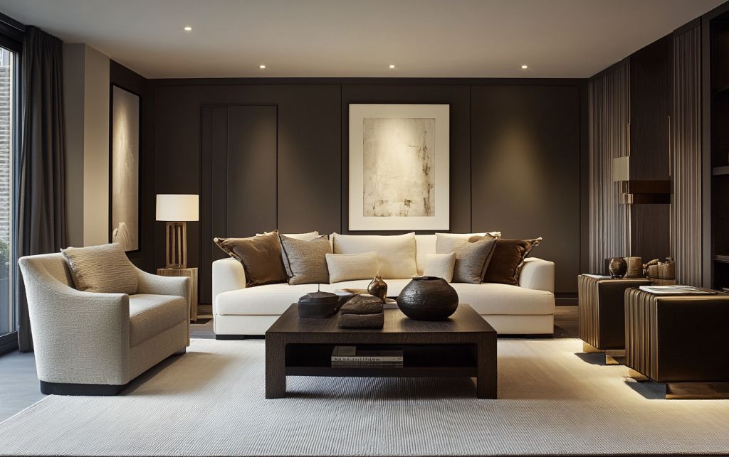
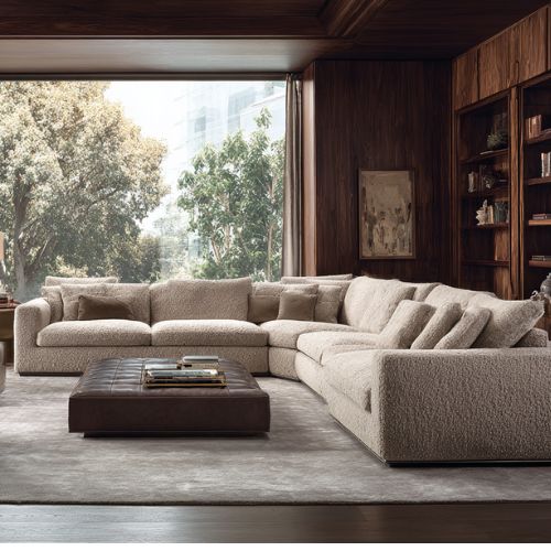
For clients seeking drama without harshness, the white and charcoal grey pairing offers the perfect solution. This combination proves particularly effective in architecturally significant spaces with generous natural light.
The juxtaposition creates a cinematographic quality. This pairing can transform ordinary rooms into spaces of exceptional sophistication through the careful manipulation of light and shadow.
The success of this pairing depends entirely on selecting the correct tone of charcoal. I advise avoiding flat, one-dimensional greys that can appear cheap or commercial. Instead, seek out complex, multidimensional charcoals with subtle undertones that shift with the changing light.
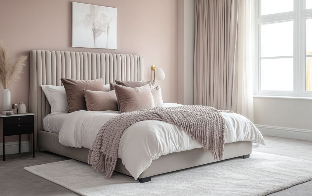
For those seeking to infuse warmth without surrendering sophistication, the combination of a white rug with blush pink elements offers an exemplary solution. This pairing proves particularly successful in spaces with northern exposure, where light tends towards coolness.
When executed properly, the effect is one of welcoming elegance—warm without becoming cloying, feminine without becoming precious. The white rug maintains the space's sophistication while the blush elements introduce a subtle warmth that transforms the atmosphere.
The key to this combination's success lies in selecting the correct shade of blush. I direct clients away from candy-like pinks toward dustier, more complex hues with grey or mauve undertones. These sophisticated variations communicate luxury in a way that clearer pinks simply cannot achieve.
Perhaps no colour communicates understated British luxury more effectively than camel when paired with a white rug. This combination speaks of heritage and permanence without resorting to obvious signifiers of wealth.
When these elements come together, the result is a space that whispers rather than shouts its considerable expense. The white rug provides a crisp foundation while the camel elements introduce a sophisticated warmth that feels simultaneously traditional and contemporary.
What I find particularly compelling about this pairing is its longevity. For clients investing in significant pieces, this assurance of lasting relevance provides considerable comfort.
For spaces that demand architectural rigour, the combination of a white rug with black elements creates a dialogue of modernist discipline. This high-contrast pairing requires confidence and restraint in equal measure.
When properly executed, the effect is one of considered restraint—a space that communicates as much through what is absent as what is present. The white rug functions as negative space, creating breathing room within the high-contrast composition.
The success of this combination hinges entirely on the quality of both the black and white elements. There's simply nowhere to hide with this pairing—any compromise in materials becomes immediately apparent.
I direct clients toward black elements with depth and complexity rather than flat, opaque variations that can appear inexpensive.
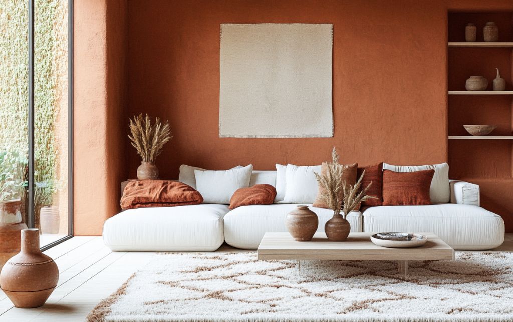
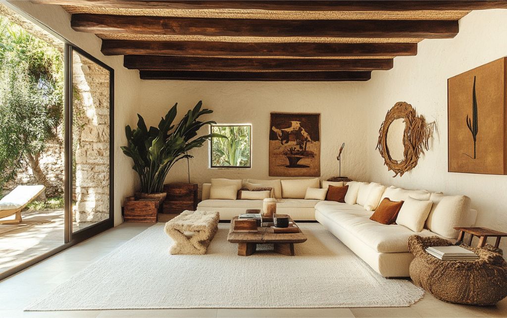
For those seeking to infuse their spaces with Mediterranean warmth without resorting to cliché, the combination of a white rug with terracotta accents offers a sophisticated solution. This pairing proves particularly effective in contemporary spaces where a touch of organic warmth is required.
When thoughtfully implemented, the effect is one of curated warmth—the perfect backdrop for artistic collections while maintaining a sense of understated sophistication. The crisp white foundation prevents the terracotta from becoming rustic or overly informal.
What makes this combination particularly successful is the grounding quality terracotta brings to a space. The earthiness anchors the ethereal quality of a white rug, creating a balanced composition that feels simultaneously elevated and accessible.
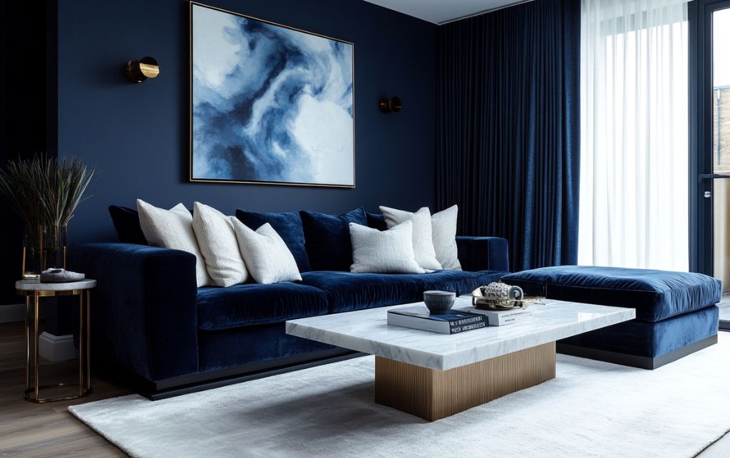
For spaces that require drama without darkness, the combination of a white rug with midnight blue elements creates sophisticated depth. Unlike navy, which tends toward tradition, midnight blue introduces a more contemporary, slightly mysterious quality.
When these elements harmonise, the effect is one of nocturnal elegance—a space that transitions beautifully from day to evening use. The white rug maintains brightness and clarity while the midnight blue introduces a captivating depth that draws the eye.
The key to this combination lies in embracing midnight blue's inherent depth while preventing it from dominating the space.
I advise introducing it through fabrics with dimension and pile—velvets, mohairs and textured wools—which interact beautifully with the varying light conditions throughout the day.
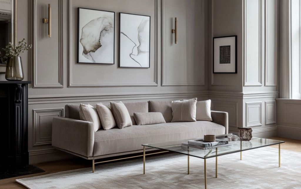
For those seeking sophisticated restraint, the combination of a white rug with warm grey elements offers nuanced neutrality. This pairing proves particularly successful in historical properties where respecting architectural heritage is paramount.
When thoughtfully composed, the effect is one of contemplative elegance—a space that respects its historical context while remaining firmly rooted in contemporary living. The white rug introduces a crisp modernity while the warm grey maintains connection to architectural tradition.
What makes this combination particularly effective is its remarkable versatility—warm grey serves as the perfect backdrop for both art and antiques, allowing them to take visual precedence while still maintaining its own quiet dignity.
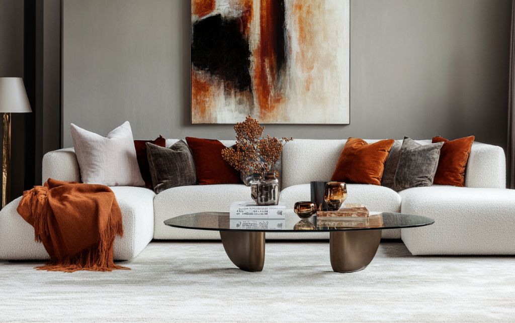
For clients seeking to introduce controlled vibrancy into their spaces, the combination of a white rug with burnt orange accents offers a sophisticated solution. This pairing brings warmth and energy without venturing into territory that might be considered overly casual.
When properly balanced, the effect is one of cultivated warmth—introducing colour in a manner that remains undeniably refined. The white rug provides a sophisticated foundation that elevates the burnt orange beyond its typically rustic associations.
The success of this combination relies entirely on using burnt orange judiciously—as an accent rather than a dominant element.
I advise introducing it through textiles and accessories rather than larger furnishings, which can quickly overwhelm the sophisticated balance we're seeking to achieve.
The most impactful white rug arrangements balance visual weight carefully, respect the rug's particular undertones and create textural dialogue between elements. Whether you're drawn to the timeless sophistication of navy, the organic warmth of terracotta, or the controlled vibrancy of burnt orange, remember that quality is non-negotiable.
Consider not merely the colour but the texture of your chosen companions—velvets, linens and silks all interact differently with your rug's surface, creating subtle but important variations in the overall effect.
And perhaps most importantly, view your white rug not as a background element but as a deliberate choice—a statement of confidence that deserves thoughtful companionship.
At FCI London, we understand that these decisions extend beyond aesthetics into the realm of lifestyle. A white rug isn't merely a design choice—it's a philosophy about how one wishes to live.
We help designers & clients transform mundane spaces into extraordinary ones.


Book a video consultation and we'll advise you on furniture, space planning, colour schemes and much more.
Book A ConsultationBook a visit to our stunning, multi award-winning, 30,000 sqft.
Over 700 brands under 1 roof.
Most Popular on FCI London: Fitted Wardrobes | Luxury Designer Rugs | Luxury Sofas | Luxury Furniture Store | Luxury Interior Designers | Luxury Bedroom Furniture | Luxury Modern Chairs | Luxury Coffee Tables | Luxury Designer Kitchens | Luxury TV Units | Luxury Dining Tables | Luxury Storage Solutions | Luxury Sideboards | Luxury Stools & Bar Stools | Luxury Bespoke Joinery | Luxury Modern Hallway Furniture | Furniture Showroom Appointment | Luxury Lighting | Modern Luxury Outdoor Furniture
Transparency isn’t a policy. It’s a principle.
Have a peek at what our clients really have to say.