Published Date: Apr 17, 2025 | Last Updated: Jun 30, 2026
Written by: Emma Cyrus, Senior Copy, Content & Editorial Writer
Reviewed by: Shahnaz Hashim, Architectural Designer at FCI London
Edited by: Zoona Sikander, Head of Content
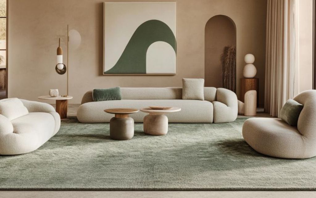
Table of Contents

Let's start with what makes sage green such a compelling choice for a statement floor covering. Unlike its bolder cousins in the green family, sage carries a dusty, muted quality that allows it to function almost as a sophisticated neutral.
It brings the organic, calming essence of the natural world inside without overwhelming the senses—a botanical note without the full concerto, if you will.
Its enduring appeal lies in its remarkable adaptability. A green rug holds its own in traditional English country houses, minimalist Scandinavian apartments and richly textured bohemian schemes alike.
This chameleon-like quality makes it an excellent foundation for numerous design directions, provided you understand how to build upon it correctly.
Before selecting companion colours for your sage green rug, it's essential to identify its particular undertones. This seemingly simple shade actually encompasses a spectrum of variations:
In the quietly sophisticated world of interior design, sage green has established itself as the thinking person's choice for floor coverings. Neither shouty like emerald nor apologetic like mint, it occupies that elusive middle ground where distinctive character meets remarkable versatility.
The moment a client expresses interest in a sage green rug, I know we're embarking on a more thoughtful design journey. It reveals an understanding that the foundation of a room deserves more consideration than defaulting to the safety of beige or the ubiquity of grey.
Yet for all its subtle brilliance, sage green demands deliberate companionship.
Pair it masterfully and you'll create interiors of exceptional depth and refinement; approach it carelessly and that investment piece risks becoming an expensive afterthought, disconnected from everything around it.
Examining your rug in both natural and artificial lighting will reveal its true character. The undertone will determine which colours will harmonise effortlessly and which might create unwelcome tension in your scheme.
The texture of your luxury rug will further influence how the colour is perceived.
A flat-woven kilim in sage will appear more vivid than a deep-pile wool rug in the same shade.
Silk brings out luminous qualities in sage, while natural fibres like jute or sisal will emphasise its earthy aspects.
Consider these textural elements when planning your complementary palette.
Now let us explore the most effective colour combinations for sage green rugs, arranged by aesthetic direction rather than mere visual appeal. After all, the goal isn't simply to create pleasing combinations, but to craft a cohesive design narrative.
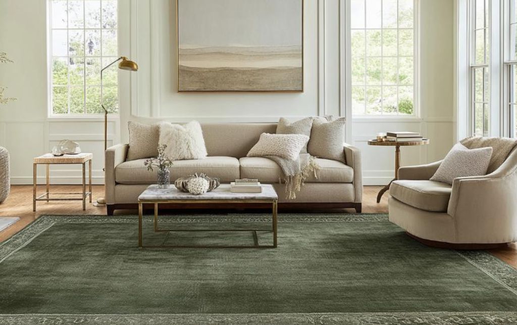
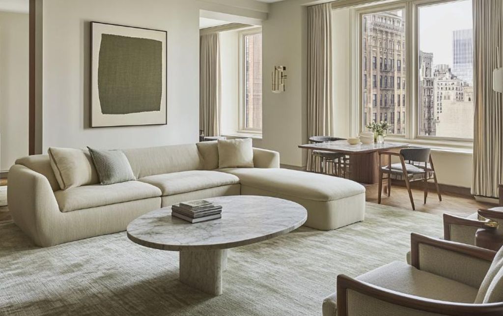
For those who appreciate restrained sophistication, pairing sage green with carefully selected neutrals creates spaces of considerable elegance:
Warm whites and creams complement sage beautifully, allowing it to stand as the gentle statement piece in an otherwise quiet room. The key is selecting whites with the faintest yellow undertone rather than stark, blue-based whites that can make sage appear dull.
Soft greys (particularly those with a slight brown undertone) create a harmonious palette when combined with sage. This combination works brilliantly in spaces where you're aiming for calm and contemplative ambiance.
Beige and stone tones bring warmth to sage green's coolness. The effect is particularly compelling in rooms with abundant natural light, where these subtle variations can be fully appreciated.
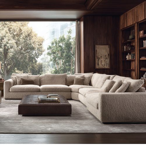
In a recent Kensington apartment project, we placed a hand-knotted sage wool rug beneath a seating arrangement of cream bouclé armchairs and a limestone coffee table.
The result was a space that felt both fresh and timeless - contemporary without being trend-led.
For interiors that aspire to a more grounded, organic feel, sage green finds natural companions in the earth tone family:
In a Hampstead residence, I recently placed a large sage green rug in a room featuring cognac leather Chesterfield sofas and raw oak side tables. The result was a space that felt simultaneously refined and relaxed - formal enough for entertaining yet comfortable for everyday living.
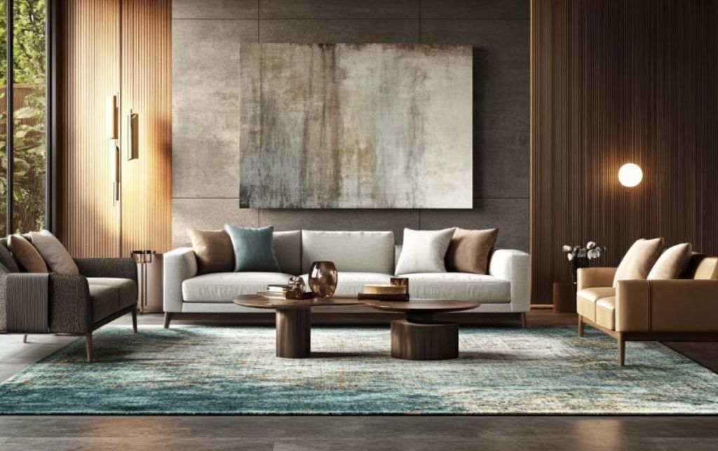
For those unafraid of making stronger statements, sage green creates compelling tension when paired with deeper, more saturated colours:
In a townhouse project, I once juxtaposed a sage green silk rug with charcoal linen sofas and black-framed artwork. The results were quite remarkable - the sage appeared more luminous against these darker elements, while the overall composition felt both modern and enduring.
Some of the most compelling combinations emerge from less obvious pairings. Sage green creates surprisingly beautiful relationships with certain pastels:
For a Notting Hill pied-à-terre, we placed a sage green flatweave rug beneath a seating arrangement featuring a sofa in the palest lavender linen. The effect was unexpectedly compelling - both soothing and quietly distinctive.
The judicious introduction of metallics can transform sage green from merely pleasant to genuinely luxurious:
For one apartment project, I paired a sage green wool rug with bronze-legged side tables and antiqued brass light fittings. The space felt simultaneously luxurious and restrained—opulent without ostentation.
In my experience, there are several pitfalls clients frequently encounter when working with sage green rugs:
The most common error is creating rooms that feel overwhelmingly green. While sage is relatively subtle, it still makes a statement.
Balance is crucial—limit additional green elements to strategic accents rather than major furniture pieces or walls, unless you're deliberately creating a monochromatic scheme.
Pairing a cool, blue-based sage with warm terracotta or mustard without thoughtful integration can create visual discord. Similarly, placing a warm, yellow-based sage with cool greys or blues requires careful consideration.
Always identify your rug's undertones before selecting companion colours.
Sage green shifts dramatically under different lighting conditions. What appears as a sophisticated grey-green in the showroom might read as distinctly mint in a south-facing room flooded with natural light.
Always test samples in your specific space, observing them at different times of day before committing.
A sage green rug can feel incongruous if it doesn't connect conceptually with other elements in your scheme. Consider how it relates to your overall design narrative—is it part of a nature-inspired palette? A sophisticated neutral backdrop? A subtle contrast to bolder elements?
Clarity of intention matters.
Each space presents its own considerations when incorporating a sage green rug:
In reception rooms, sage green rugs provide an excellent foundation for both neutral and more colourful schemes. Consider the following approaches:
The living room tolerates more complex colour combinations than other spaces, but maintaining a clear hierarchy of dominant, secondary and accent colours remains essential.
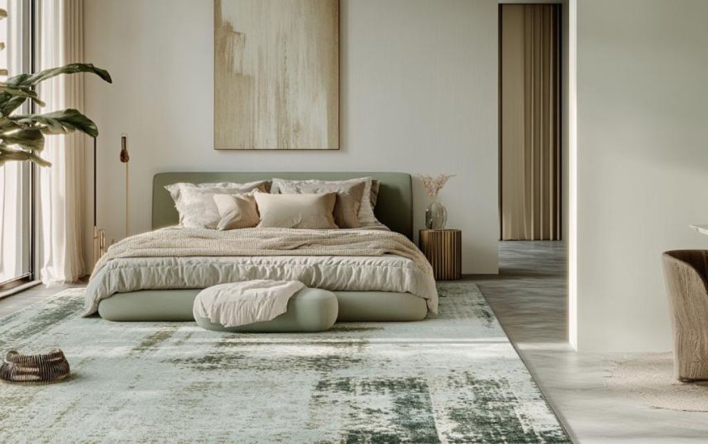
In bedrooms, sage green rugs contribute to an atmosphere of tranquility and balance:
Remember that bedroom rugs often appear larger than living room rugs relative to the room size, making their colour impact more significant.
Sage green rugs in dining spaces create a foundation of understated elegance:
Do consider practicality in dining areas - flat-weave rugs in darker sage tones will disguise inevitable spills and marks better than paler, plush alternatives.
Creating truly sophisticated interiors requires attention to how elements relate across the entire space:
Rather than simply matching colours exactly, distribute your palette throughout the room at varying intensities. If your sage rug is the foundation, perhaps sage appears again in a paler shade on a cushion and once more as the background tone in artwork.
Balance the texture of your rug with other textiles in the space. A flat-woven sage rug might be complemented by linen upholstery and smooth velvet cushions, creating interest through textural variation rather than bold colour contrasts.
Use accessories to strengthen relationships between your sage rug and other colours in the room. A sage and cream patterned cushion, for instance, can create a bridge between your rug and cream upholstery, making the relationship feel intentional rather than accidental.
There is no absolute rule regarding monochrome versus contrasting schemes with sage green rugs, but there are helpful guidelines:
Consider monochromatic or tonal approaches when:
Consider more contrasting palettes when:
The beauty of sage green lies in its remarkable versatility. Whether you're drawn to its connection to the natural world, its sophisticated subtlety, or simply its departure from more expected neutrals, it offers numerous possibilities for creating distinctive interiors.
Consider your rug not merely as a floor covering but as the foundation of your entire colour scheme—a starting point from which a cohesive design narrative can unfold.
Identify its specific undertones, observe it in your particular lighting conditions and build your palette with thoughtful intention.
Whether paired with refined neutrals, warm earth tones, dramatic contrasts, unexpected pastels, or elevated with metallic accents, sage green rugs offer a foundation of quiet confidence—neither showy nor boring, neither trend-driven nor conventional.
In a world where interior fashion moves with increasing speed, sage green represents something more enduring: sophisticated colour with timeless appeal. And if anyone tries to tell you that green is merely this season's trend, well, they're probably trying to sell you something that won't look nearly as good next year.
About the Author: After two decades of specifying rugs and colour schemes for properties across Europe and the Middle East, our author has developed an encyclopedic knowledge of colour theory and an allergic reaction to poorly considered combinations. They continue to work with both contract and residential clients, helping them make informed decisions about their investments.
We help designers & clients transform mundane spaces into extraordinary ones.


Book a video consultation and we'll advise you on furniture, space planning, colour schemes and much more.
Book A ConsultationBook a visit to our stunning, multi award-winning, 30,000 sqft.
Over 700 brands under 1 roof.
Most Popular on FCI London: Fitted Wardrobes | Luxury Designer Rugs | Luxury Sofas | Luxury Furniture Store | Luxury Interior Designers | Luxury Bedroom Furniture | Luxury Modern Chairs | Luxury Coffee Tables | Luxury Designer Kitchens | Luxury TV Units | Luxury Dining Tables | Luxury Storage Solutions | Luxury Sideboards | Luxury Stools & Bar Stools | Luxury Bespoke Joinery | Luxury Modern Hallway Furniture | Furniture Showroom Appointment | Luxury Lighting | Modern Luxury Outdoor Furniture
Transparency isn’t a policy. It’s a principle.
Have a peek at what our clients really have to say.