Published Date: Aug 11, 2025
Written by: Emma Cyrus, Senior Copy, Content & Editorial Writer
Reviewed by: Perla Mignanelli, Senior Interior Designer at FCI London
Edited by: Zoona Sikander, Interior Design Writer & Social Media Content Creator
Estimated Reading Time: 8 minutes
TLDR: Contrary to popular belief, colour doesn't date kitchens - poor execution does. This guide presents ten designer-approved colour schemes that balance bold personality with enduring sophistication. From deep forest greens to soft lavender greys, each palette demonstrates how thoughtful colour selection, informed by light quality and architectural context, creates kitchens that grow more inviting with time rather than fade with passing trends.
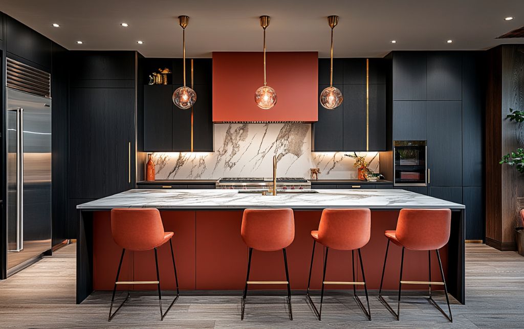
Table of Contents
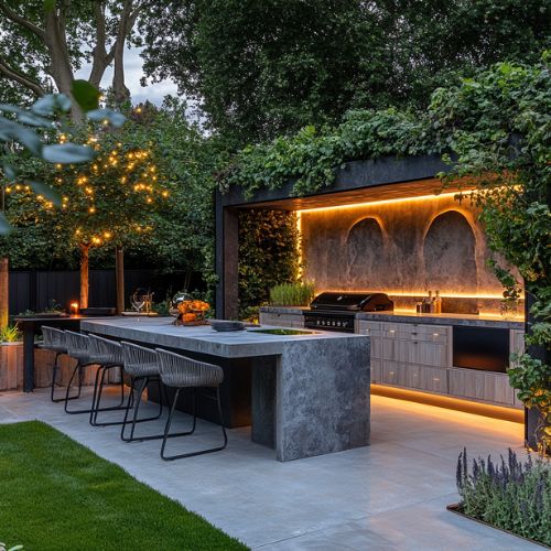
The kitchen has become the most revealing room in a luxury home, not for what it displays, but for what it reveals about the homeowner's confidence. Whilst many high-end London residences retreat into safe neutrals, the most compelling kitchens embrace colour with architectural precision. For discerning homeowners in London and the Home Counties working with properties valued at £1.5 million and above, colour isn't a risk; it's a strategic design decision that separates timeless sophistication from formulaic interiors.
The persistent myth that colour inevitably dates a kitchen has created a peculiar situation in Britain's finest homes: technically flawless spaces that somehow lack soul. Yet walk into any historically significant interior, from Georgian townhouses to Arts and Crafts estates, and you'll find colour used fearlessly, rooms that have remained relevant for decades, even centuries. The difference isn't the presence of colour, but the intelligence behind its application.
What follows is a carefully considered edit of ten colour strategies that endure in the most thoughtful homes. These aren't trends masquerading as timeless advice; they're proven approaches that reward daily living rather than momentary impact. Interior designers managing premium residential projects will find these palettes particularly valuable for clients seeking genuine character without sacrificing longevity. These kitchen ideas demonstrate how confident colour choices create spaces that deepen with familiarity rather than fade with fashion. Each of these colourful kitchen ideas shows sophisticated palettes working in harmony with architectural principles. The following paint ideas for colourful kitchens prove that bold doesn't mean fleeting when executed with precision.
What makes certain kitchen colour schemes feel timeless while others quickly lose their appeal? The answer lies in how well they relate to both the architecture and the lifestyle they serve. Successful palettes account for natural light, the scale of the room and the surrounding materials that will anchor them for years to come.
Contemporary luxury kitchens benefit from what one might call 'grounded palettes', combinations inspired by nature, architecture or classical references rather than trend-led statements. Many modern kitchen colours draw inspiration from nature to remain timeless yet fresh. These schemes hold visual interest while offering the quiet sophistication that adapts gracefully to evolving furnishings.
It's worth noting that the modern kitchen has long moved beyond pure functionality; it's now the social heart of the home. Colour choices should reflect this shift, creating an atmosphere that feels just as inviting for solitary morning coffee as it does for lively evening gatherings.
Key Takeaway: Timeless palettes succeed by respecting architecture, light quality and daily living patterns rather than chasing trends. Grounded colour schemes inspired by nature and classical references create kitchens that deepen in character rather than date with passing fashion.
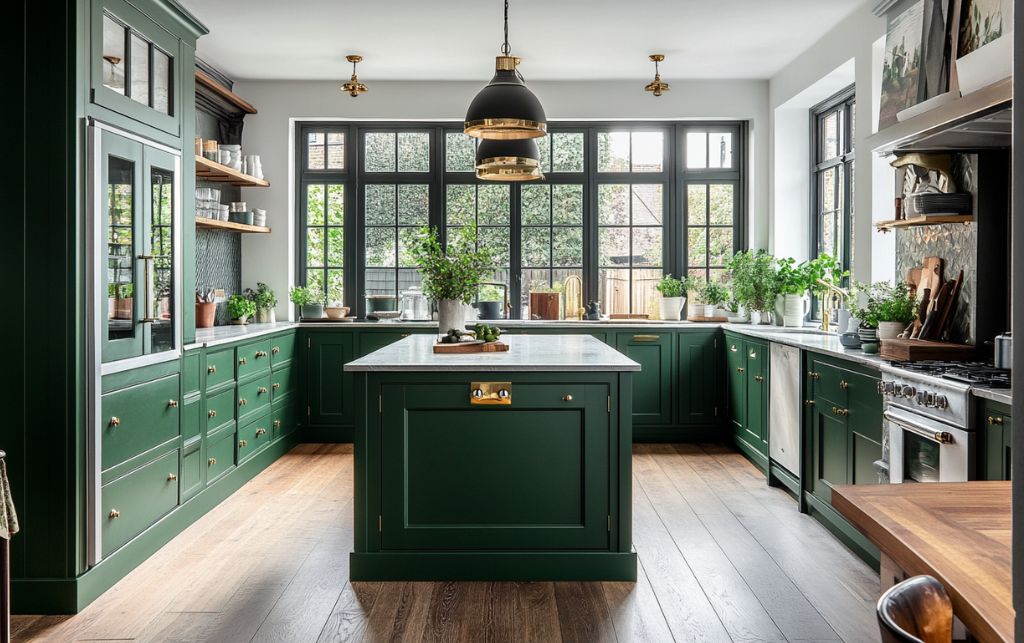
Forest green cabinetry with warm brass hardware exudes an understated luxury that feels far removed from fads. This pairing works particularly well in period homes, complementing original features while offering a refined contrast to traditional details.
The depth of green grounds the scheme, while brass adds warmth and a subtle glow. Discerning homeowners often use this combination on island units or lower cabinetry, balanced with lighter hues above to maintain an airy sense of space.
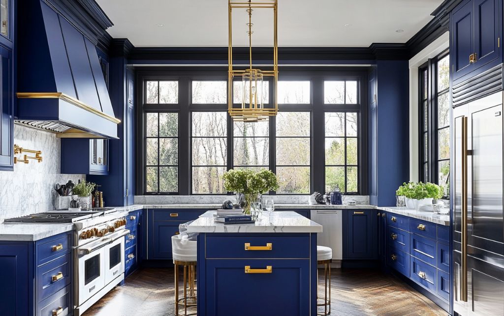
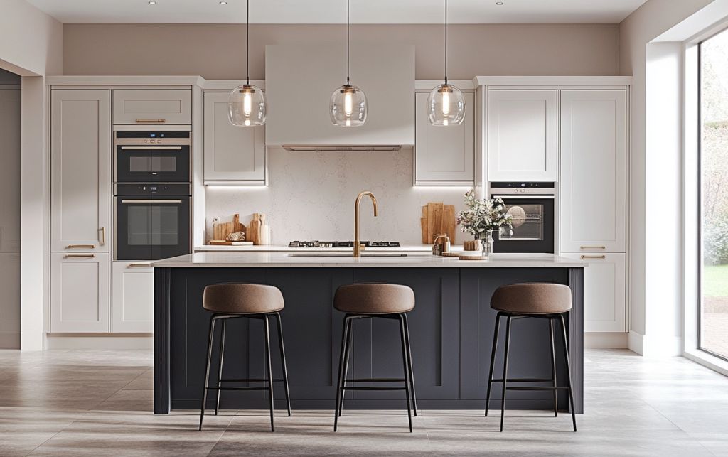
We all love white shaker kitchens, but if you want to add some colour, then few partnerships are as enduring as the classic blue and white colour scheme. Navy cabinetry alongside crisp white marble worktops and painted brick or tiled splashbacks creates a look that feels both classic and distinctly modern.
The contrast defines zones without fragmenting the room, giving structure while keeping it bright and welcoming. Here, navy lends depth while white elements reflect natural light throughout the day.
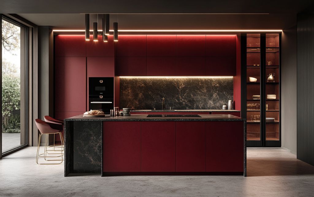
Red kitchen ideas require a careful hand, yet when executed well, they bring remarkable warmth and character. Deep burgundy or matte crimson cabinetry adds richness without overpowering.
Balance is key. Many designers advise pairing deeper reds with neutral stone worktops and restricting the colour to an island or feature wall. The result? A striking focal point that retains the composure expected in a luxury kitchen.
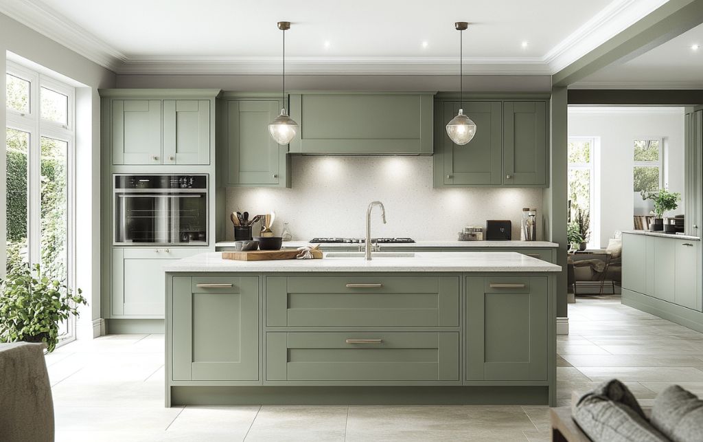
Sage green is among the most versatile choices for modern kitchens, softly spoken yet full of personality. It pairs beautifully with natural stone worktops and suits both classic and contemporary settings.
Its organic quality introduces a calm that's particularly welcome in bustling family kitchens. Larger layouts often carry this colour across multiple features without overwhelming the room's proportions.
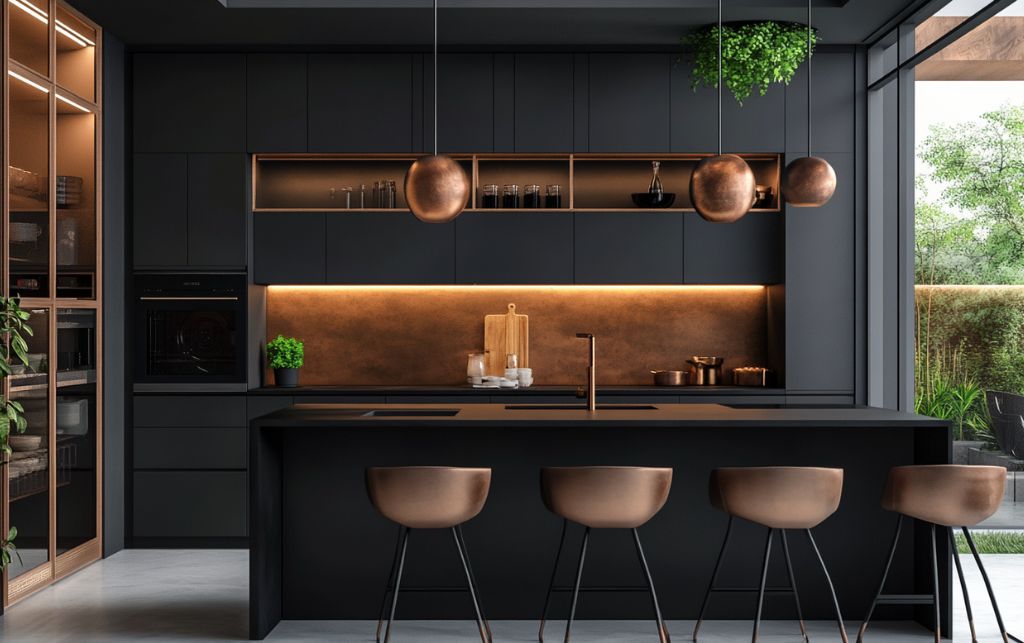
Charcoal cabinetry accented with copper details delivers a palette that feels grounded yet current. The interplay between cool, industrial greys and the warmth of metallic copper creates a subtle drama.
What sets this pairing apart is its flexibility. The neutral charcoal base allows accessories and accents to evolve seasonally, ensuring the kitchen always feels fresh. I do recommend pairing this combination with dark bar stools for a dramatic look.
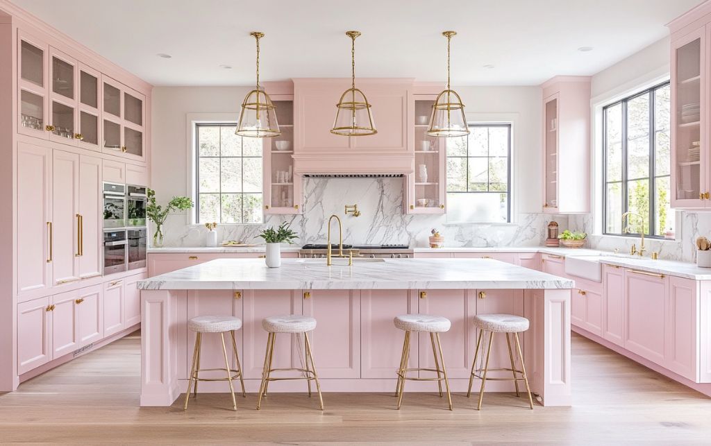
Blush pink, used thoughtfully, can transform a kitchen into a study in quiet elegance. For the best effect, choose shaker-style cabinetry painted in pinks with soft grey undertones, pairing them with white marble and brass fixtures.
Natural light plays a pivotal role here; watch how the hue shifts gently from dawn to dusk, lending an ever-changing quality to the space.
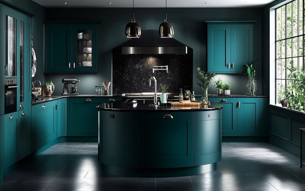
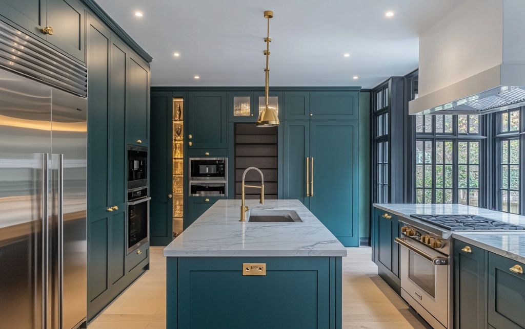
Teal cabinetry introduces depth and personality without sacrificing the gravitas required in high-end kitchens. Paired with black granite worktops and ironmongery, the effect is bold yet refined.
Larger kitchens particularly benefit from this approach; rich teal grounds the scheme without enclosing it. Often, homeowners keep teal to lower cabinets, leaving upper sections light to preserve openness.
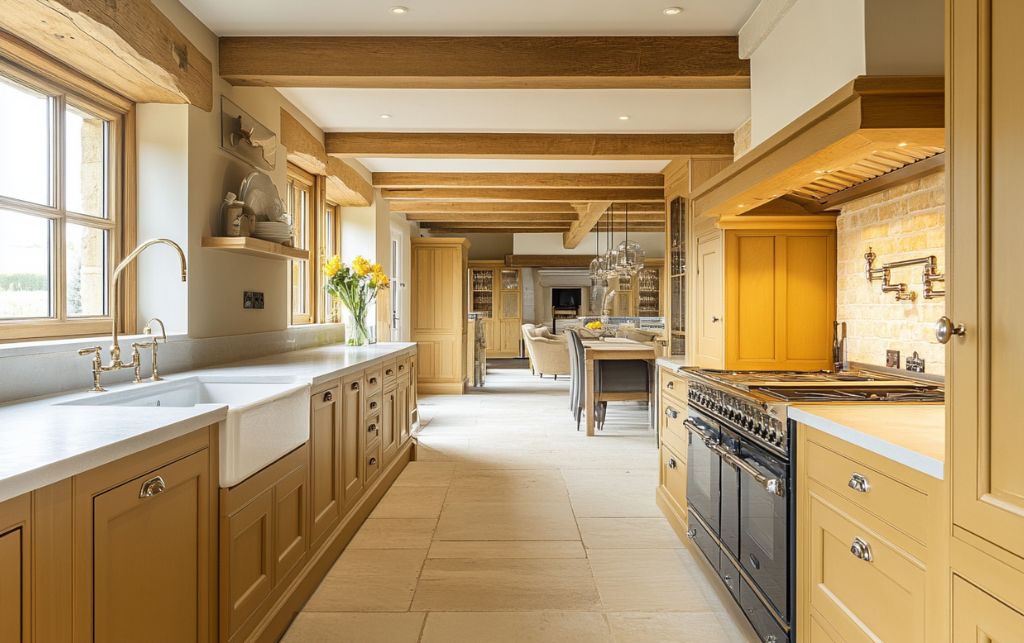
Ochre-painted cabinetry combined with natural timber brings an earthy warmth that feels both sophisticated and inviting. This palette sits beautifully alongside stone worktops and can bridge traditional and contemporary interiors alike.
The layered warmth ensures the scheme never feels flat; its complexity grows richer with time.
Midnight blue remains a favourite among designers seeking drama without brashness. Paired with polished nickel hardware and pale stone surfaces, this palette achieves an elegant balance.
Where natural light is abundant, midnight blue reveals subtle shifts from deep blue to near-black, offering constant visual interest that wards off monotony.
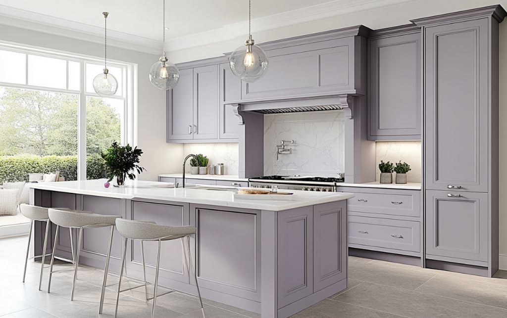
Lavender grey offers a gentle personality anchored by the neutrality that ensures longevity. It lends itself well to both classic and contemporary kitchens.
When teamed with chrome hardware and white or pale worktops, the result feels calm, current and enduring, precisely what discerning clients seek for long-term appeal.
Key Takeaway: Confident colour choices anchored by quality materials and thoughtful execution create enduring kitchen schemes. Each palette demonstrates how bold hues, when properly balanced with complementary finishes and architectural context, reward long-term living.
What ensures that bold kitchen colours remain relevant for decades?
Confidence, not caution, creates enduring spaces.
The most successful colourful kitchen design ideas combine confidence with a deep respect for materials and light. Colours chosen with conviction, guided by materials, scale and light, develop a graceful patina rather than looking worn or tired.
Always consider how your chosen palette interacts with your home's architecture. Colours that echo, rather than clash with, original features naturally feel more permanent. Likewise, respecting the quality of natural light in your space guarantees the palette flatters at all hours.
One might appreciate the reassurance of expert advice. An experienced interior consultant understands how colour, material and light converge, crucial in kitchens where practicality and beauty must coexist seamlessly.
Key Takeaway: Successful bold colour schemes respect materials, light and architectural features rather than fighting against them. Conviction guided by context creates spaces that develop graceful patinas instead of appearing tired or outdated.
Even seasoned homeowners sometimes stumble when it comes to colour. A few missteps are surprisingly common, yet easily avoided. Choosing kitchen colour ideas without considering light or finishes often leads to disappointing results.
Choosing Colours in Isolation: Paint swatches can be misleading. Colours shift dramatically when seen alongside cabinetry, flooring and worktops under your home's unique light. Always test samples in situ and observe them at different times of day.
Ignoring Light Quality: North-facing kitchens benefit from warmer hues that counterbalance cool light, while south-facing rooms can welcome crisper tones. Don't overlook the role of artificial lighting, too; it can transform a colour's appearance after sunset.
Overlooking the Finish: A single colour can read vastly differently in matte, satin or gloss. Matte finishes add depth and richness; gloss bounces light and brightens. Choose what suits both your taste and maintenance expectations.
Key Takeaway: Testing colours in isolation without considering light quality, surrounding materials and finishes leads to disappointing results. Observe samples in situ throughout the day alongside actual cabinetry and worktops to understand how colours truly perform in your specific environment.
Colour doesn't exist in a vacuum. The most successful schemes relate subtly to adjacent spaces, especially in open-plan homes. Shared undertones help link rooms together, creating the quiet flow that defines truly sophisticated design.
This approach ensures each space has its personality, yet never feels disconnected from the whole, a hallmark of thoughtful, high-end residential projects.
In the end, timeless colourful kitchens aren't about trends. They reflect your taste, enrich everyday life and grow more beautiful over the years. Thoughtful colour, applied with restraint and understanding, creates a kitchen that feels fresh for decades.
Your kitchen is a substantial investment, both financially and emotionally. When you select colourful kitchen ideas thoughtfully, they reward you daily, making expert guidance invaluable for achieving results that fulfil both your aesthetic vision and practical demands.
Key Takeaway: Shared undertones between adjacent spaces create sophisticated flow without sacrificing individual room character. Subtle colour relationships prove particularly crucial in open-plan layouts where visual continuity distinguishes thoughtful design from fragmented schemes.
How do I choose a kitchen colour scheme that won't look dated in ten years?
Select palettes inspired by nature, architecture or classical references rather than trend-driven statements. Colours with depth and complexity, such as forest green, navy blue or charcoal grey, develop graceful patinas over time. Always consider how your chosen hues interact with natural light and surrounding materials, ensuring they complement rather than compete with your home's architectural features.
Should I use the same finish throughout my colourful kitchen or mix matte and gloss?
Consistency in finish typically creates a more cohesive, sophisticated result. Matte finishes deliver depth and understated elegance whilst concealing minor imperfections, making them particularly suitable for high-end cabinetry. Reserve gloss for smaller accent areas if desired, but avoid mixing finishes across primary surfaces, as this can fragment the visual harmony essential to timeless design.
How can I incorporate bold colour without overwhelming a smaller kitchen?
Restrict saturated hues to lower cabinetry or a single feature wall, keeping upper sections light to preserve an airy sense of space. Pairing bold colours with pale stone worktops and neutral flooring grounds the scheme without enclosing it. This approach creates a striking focal point whilst maintaining the open, balanced proportions that smaller kitchens require.
What's the best way to test kitchen colours before committing to a full installation?
Order large sample pots and paint substantial boards that you can move around the space, observing them at different times throughout the day and evening. View samples alongside your actual cabinetry materials, worktop stone and flooring under both natural and artificial light. This method reveals how colours truly perform in your specific environment, preventing disappointments that smaller swatches cannot predict.
Address & Hours:
FCI London, Rays House, North Circular Road, London, NW10 7XP
Monday - Saturday: 10am - 6pm
Sunday & Bank Holidays: 11am - 5pm
Contact Details:
Phone: +442081531235
Email: [email protected]
What to Bring:
The most enduring kitchens aren't designed to impress for a season; they're crafted to enrich daily life for decades. Thoughtful colour selection, informed by light quality, architectural context and quality materials, creates spaces that grow more compelling with familiarity. When you invest substantially in your kitchen, expert guidance ensures your vision translates into results that satisfy both aesthetically and practically, rewarding you every single day.
Natasha Grossman
"From start to finish, our experience at FCI was fantastic. We were searching for a new kitchen table and dining set, and Aziz offered exceptional care and attention throughout. His guidance helped us find furniture that perfectly complements our home. We’re thrilled with the result, beautiful, functional pieces that will be cherished in our kitchen for many years to come."
Nedelia Martin
"I discovered FCI London almost five years ago and keep returning whenever I need new furniture. Their selection is fantastic, with great options for every room, including my kitchen. The staff and designers were attentive and knowledgeable, special thanks to Andrei, Rohan, and Sanjay for making everything seamless. Excellent quality, stylish designs, and consistently wonderful service."
Carol O’Regan
"Ricardo at FCI offered excellent service, guiding us through selection, ordering, and delivery with real expertise. We bought six dining chairs and three bar stools for our kitchen, and though the wait was long, the quality was outstanding. Everything fits perfectly and looks superb. We’ll definitely return to FCI for future furniture purchases. A truly professional and pleasant experience overall."
We help designers & clients transform mundane spaces into extraordinary ones.


Get In Touch
Book A Video Chat
Book a video consultation and we'll advise you on furniture, space planning, colour schemes and much more.
Book A ConsultationVisit Our Showroom
Book a visit to our stunning, multi award-winning, 30,000 sqft.
Over 700 brands under 1 roof.
Most Popular on FCI London: Fitted Wardrobes | Luxury Designer Rugs | Luxury Sofas | Luxury Furniture Store | Luxury Interior Designers | Luxury Bedroom Furniture | Luxury Modern Chairs | Luxury Coffee Tables | Luxury Designer Kitchens | Luxury TV Units | Luxury Dining Tables | Luxury Storage Solutions | Luxury Sideboards | Luxury Stools & Bar Stools
Transparency isn’t a policy. It’s a principle.
Have a peek at what our clients really have to say.